This is the extended version of my lightning talk from the second PyData Bristol meetup.
The basic idea for this visualisation – using Voronoi diagrams to map air quality data – is one I’ve been carrying around for several years, but only recently did I have the right combination of data, tools, and project time to make it a reality. My new job at OVO required me to dust off my python skills – for which I prefer a toy project to abstract study – and gave me access to Tableau, which meant I could lean on its mapping capabilities and easy sharing of visualisations. Working for a green energy company also seemed more appropriate for shining a light on poor air quality than my previous roles in aviation! Open Data Bristol provided the raw material – although their site seems to be in flux, with the exact dataset I used no longer available – and here’s what I did with it:
Voronoi diagrams in the wild
So what is a Voronoi diagram? Given a particular point from a set of points – in this case, individual air quality monitors set up around Bristol – the Voronoi cell is all the locations which are closer to that point than any of the others. A Voronoi diagram (or tessellation) is then the collection of all these cells; here, it partitions Bristol so that for any location in the city, you can see at a glance the air quality reading from its nearest monitor. This has a more instant impact than just plotting the points: highlighting that poor air quality likely affects broad areas, not just a particular monitor; and eliminating the need to determine the nearest sensor to a place of interest (especially as zooming to a local level of detail may remove monitors from view entirely).
However, I’m not aware of any dataviz programs that offer Voronoi diagrams ‘out of the box’, and indeed, this is not their main field of application. They arise in an impressive variety of domains across mathematics, CS and the natural sciences – and have even found their way into artistic endeavours – so I’m surprised that they don’t appear in undergraduate curricula. Or, at least, they didn’t feature in mine; so here’s a few contexts in which I’ve since encountered them!
Biology

Long-necked Voronoi diagrams
Instead of thinking of Voronoi cells as being constructed, we can imagine them arising organically. If we have growth occurring at the same rate from multiple seed sites, then collisions will occur precisely at the boundaries of the Voronoi cells corresponding to those sites. Similarly, if pigments or other chemicals are spread from the sites, they will meet and react for the first time along those same boundaries. As a result, Voronoi diagrams can be used to model natural phenomena ranging from the skin patterns of giraffes to the structures of tortoise shells or dragonfly wings (Wikipedia has a neat animation of this).
Physics
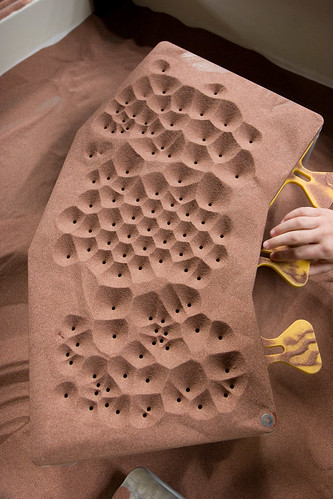
Making Voronoi diagrams with sand
If waiting for biology seems too slow, you can also produce your Voronoi diagrams with physics. In the above example, holes have been drilled into blocks covered with fine sand; once the holes are uncovered from below, some sand will flow through. But grains will drain out from their nearest hole, and are more likely to do so if they’re closer. Thus, once the pile settles, it does so with ridges at the locations furthest from the holes: that is, the boundaries of the Voronoi cells. Similar processes occur in mud cracking, lava cooling or soap bubble formation; these can be thought of as physical optimisation algorithms, where in this case the best solution relates to your nearest or furthest neighbour. (By analogy, we can exploit Voronoi diagrams to answer operational research style problems such as where best to place a new shop or distribution centre.)
Architecture
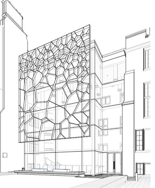
Design for the Fry building, University of Bristol
Voronoi diagrams have become popular in architecture, particularly as screens or roofs, where the irregular cell layout enables a mixture of light and shade patterns (and an alternative, more organic, aesthetic than arises from grid-based designs). A local example will soon be found in pride of place at the University of Bristol’s Fry building, which will be the new home for the School of Mathematics. However, their summary doesn’t specify what it’s a diagram of!
Voronoi diagrams in python
Obtaining Voronoi cells
The mathematics of Voronoi diagrams belongs to discrete and computational geometry, and I highly recommend the book of the same name by Devadoss and O’Rourke – so good, I actually have two copies! This was an area that I dabbled in shortly before I departed academia, and have always wanted to do more with.
Fortunately, python being python, there’s no need to reinvent the wheel. Importing voronoi from scipy.spatial we can easily construct and plot the Voronoi diagram from an array of X,Y pairs describing our points of interest:

The blue points are the original sites, whilst the orange ones are the vertices of the Voronoi cells (or regions as they are referred to here). So at first glance, it might seem that we’re done… but on closer inspection – or rather, further, by expanding our viewing window from the conveniently chosen one – some issues are revealed:

The ‘problem’ is with the outer cells, and mathematically there is no problem at all. Recall that the goal of the Voronoi diagram is to divide up the plane into regions according to their closest site. But this is the idealised mathematical plane: in the simplest case of two starting points, the entire (flat) universe is divided into two infinite halves, separated by the perpendicular bisector of the line through the points. For more complicated collections of points, we get two types of Voronoi cells: the finite ones, with a well defined boundary made up of finite line segments; plus the infinite ones, where borders shared with other infinite cells will be rays that extend indefinitely from a boundary point. In the plots above, these rays are represented by dashed lines rather than the solid boundaries of the finite cells.
The Voronoi methods actually handle this by working with the list of boundary vertices for each region, rather than its ‘shape’. Each orange point we see carries an index, from which we can recover its coordinates in the plane. But there is also a ‘point at infinity’ (with index -1) for which there is no corresponding point; the infinite regions are those which include this point in their vertex list.
Obtaining finite Voronoi cells
For visualisation purposes, we’d like to restrict the cells to fall within some bounding box – in our case, large enough to include all our air quality monitors, but not otherwise stray too far from Bristol. As we’ll soon see, there are python data structures that make this operation straightforward for polygons – but we need to deal with those infinite regions first. The trick is to turn them into large – much larger than our eventual area of interest – but finite polygons first, by projecting those infinite boundary rays out much further before truncating.
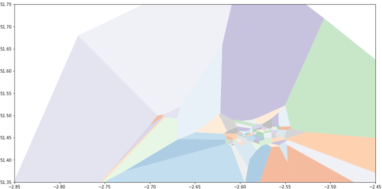
I would like to say I thought through the mathematics for this, but instead I turned to Stackoverflow, suspecting that others had had the same problem. Sure enough, this question – and this solution by user ‘sklavit’ – give us the pieces we need. This plot, on the same axis as before, but now showing individual polygons rather than collections of points and lines – illustrates some of the effect:
Working with shapes in python
Sklavit’s solution actually contains two parts: generating the finite regions as lists of boundary vertices; then using the shapely library to construct Polygons with those boundaries. These can then have geometric operations easily applied to them; in particular, a bounding box polygon can be created and the intersection of this with each Voronoi cell found.
This suffices to demonstrate their solution to the problem. But in practice, working directly with individual polygons can be fiddly – there are issues with shared boundaries, for instance – and for our visualisation purposes we’d need some book-keeping to track which data values correspond to each cell (especially if the original points are no longer contained in any of the bounded polygons).
We can therefore benefit from a more elaborate structure. The geopandas library extends pandas data frames to allow each row to have a geometry (described by a shapely polygon). This allows us to perform set-theoretic operations on collections of shapes en-masse, and get a new collection back. Better still, we can associate our shapes with data and metadata, and this will be carried through to the new shapes as appropriate.
For example, taking the union of overlapping shapely polygons directly only gives us a single larger polygon. With geopandas, we get a collection of polygons which add up to the same result, but track each piece’s relationship with the original polygons. Here’s an illustration of that effect:
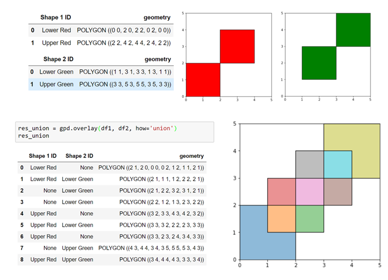
For our purposes we can therefore preview the effect of applying a particular bounding box, by considering its union with a geodata frame of the finite cells:
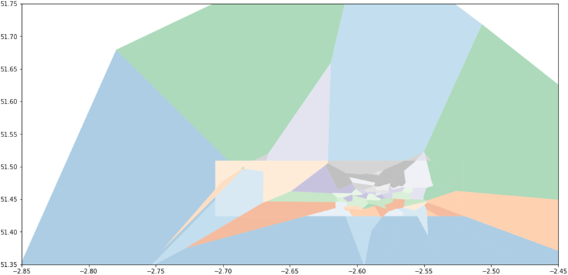
Although, of course, it is the intersection that we actually wish to keep:
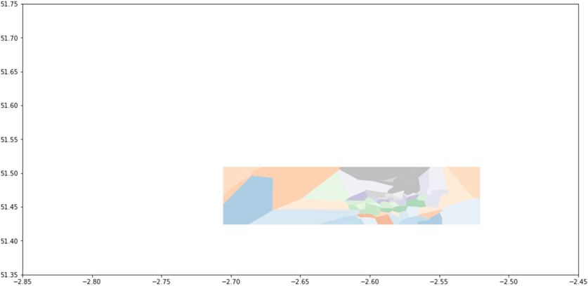
where each of the surviving shapes has data columns inherited from the finite cells, which could themselves have been easily associated with monitor data (since shapely allows us to test whether a point is contained in a polygon).
Putting it all together
Working with shapes in tableau
From here we can move to Tableau, provided we can translate to data it understands. This is fairly straightforward, once you’re aware of a few quirks of Tableau’s polygon mark type…
- A Tableau polygon is defined by a set of boundary points, and we need one data row per point.
- An index or label is needed to indicate which points belong to which polygon (and should be applied to the detail or colour shelf).
- An additional path index is needed to indicate the order in which the boundary is constructed from the points (and should be applied to the path shelf).
- Unlike shapely polygons and, confusingly, tableau’s path mark type, you should not ‘close the loop’ by repeating the initial vertex.
Thus the remaining task in python is to produce these appropriately indexed lists of points. These could then be merged back to the original data in Tableau, but I found it simpler (albeit wasteful of space) to produce a single file, replicating each cell’s data across all its boundary points.
If you wish to be able to plot both the cells and the original sites, then you’ll need to use a dual axis plot in Tableau, and differentiate the two types of geometry (polygon and point) in the data. You’ll also need to hide the boundary points of each cell (or use the shape shelf to render them invisible), since Tableau filters apply to both axes simultaneously. The visualisation above demonstrates this effect if you enable the ‘Show Monitor Locations’ option.
Example notebook
Our recipe is therefore as follows:
- obtain some data with X,Y coordinates;
- recover the (potentially infinite) Voronoi regions;
- reduce these to finite Voronoi cells;
- truncate these to polygons within a suitable bounding box;
- convert to a point-by-point format for Tableau.
I’ve implemented each of these steps in a Jupyter notebook, which you can find here. Note that this only produces the output needed for a single Voronoi diagram using the 2016 air quality data, which is (currently) available under the Open Government Licence v3.0. To produce the multi-year visualisation (with a diagram for each year based on the monitors that were active then) I simply iterated this process, and added year as an additional column before concatenating the output and exporting to Tableau; sadly this is no longer available as a single data set!
Limitations
Although I’m happy with this particular visualisation, this code is not suitable for all such uses. This is because the process makes a faulty – but apparently increasingly popular – assumption: that the world is a flat plane! Since we actually live on (roughly) a sphere, this creates a couple of issues when treating longitude and latitude as if they were X,Y coordinates.
Firstly, we define our Voronoi cells by their boundary vertices, which we then join by a ‘straight’ line. However, the shortest path from one geographic coordinate to another – e.g. an edge of a cell – would be a great circle, which appears as a curve under this projection. Fortunately, this distortion is relatively minor for paths across, say, Bristol. But it is worth keeping in mind at an international scale; this example shows how Tableau (in orange) would render a triangle between three major airports, versus how it would slice a segment out of the globe (in blue):
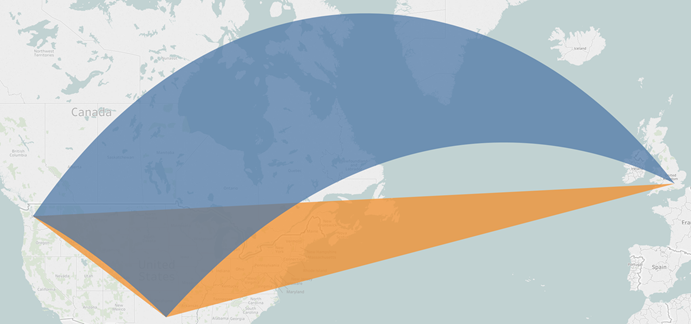
One solution would be for Tableau’s path rendering to be aware of these issues; alternatively, we could compute these curves in python first and output a much larger number of points to define the boundary of each cell.
However, treating geographic coordinates as points in a plane will cause much bigger problems elsewhere in the world, regardless of scale:
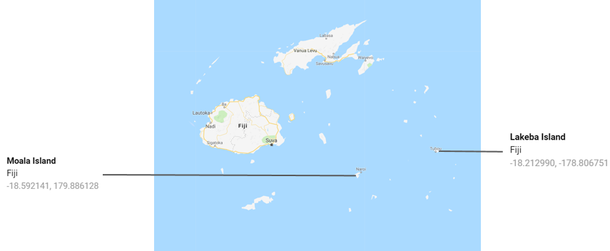
Had we been attempting to map Fijian rather than Bristolian air quality, we’d have run into difficulties as extremely negative and positive longitudes indicate locations which are close by, not far apart. Although latitude at the poles does not have the same ‘wrap around’ effect, distortion would be pronounced there too.
Fortunately these are known and solved issues, resulting in spherical Voronoi diagrams and some of my favourite visualisations. So if you found all of this straightforward, I’d love to see a python implementation that computes these correctly anywhere on the globe, and can then project them to a map!